
So far I have about 9 pieces for my breadth portfolio. I tried to include a variety of mediums: so far I have charcoal, watercolor, sharpie and colored chalk, an ink print, and several oils. I still need an acrylic and pencil piece. I am the world's worst procrastinator in everything that I do, so that definitely was a huge mistake that I didn't even need to read an article to realize that I made. However the one about continually restarting work was something that I have been doing and didn't even realize: I am usually somewhat of a perfectionist with my art and I have been worried that my pieces won't be of good enough quality; for example they won't be on the right paper, or that I don't have the right brushes or color paints, or that I will mess up etc. And these fears have been keeping me from starting and finishing a lot of pieces because I am afraid they won't be perfect. It took me forever to think about what I want in my portfolio because I didn't think anything I had was good enough! Looking at the gallery above, however, I am so glad I included what I did. Having 9 pieces right now makes me feel so much more at ease about eventually completing the breadth portfolio. It will make the future much easier going forward because I won't be absolutely overwhelmed with the amount of work I have to do (hopefully), and I can be more organized.
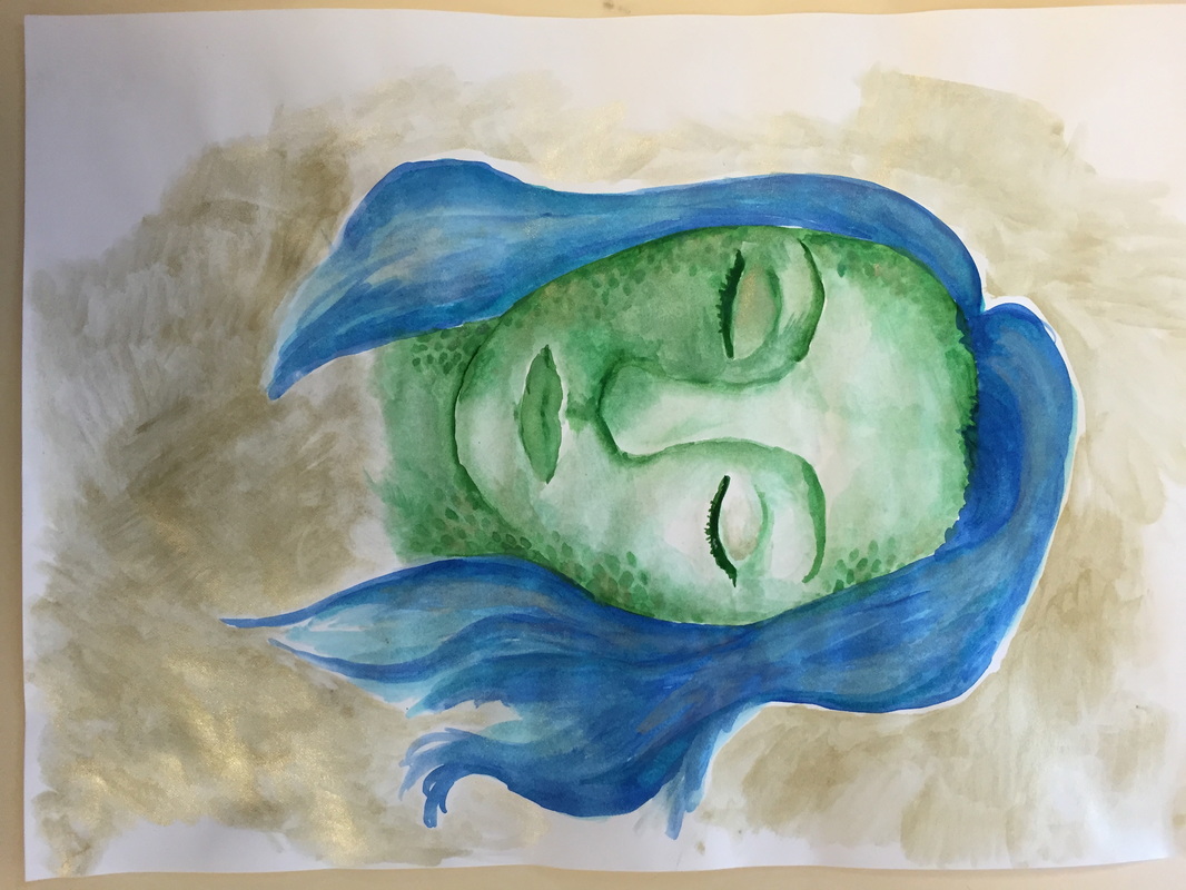
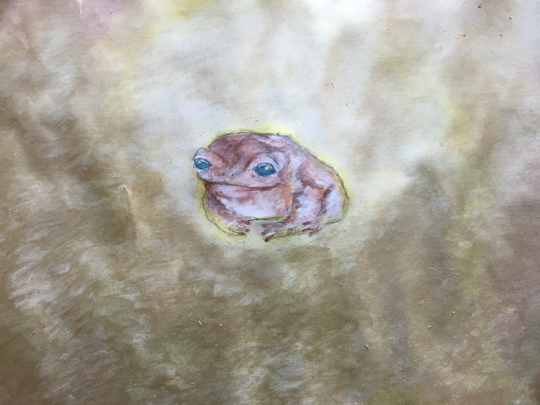 I thought forever about what my piece should be, and had a really difficult time coming up with something. I started a new project and then scrapped it every day. Finally it hit me. I decided to do a watercolor of a toad. I’ve settled on “The Valuable Toad” for my title because the simple sketch of the toad is made into something much more valuable when the watercolor is added. I really like the gold background because it brings out the beauty in the toad; a creature that is often considered ugly and warty. I was inspired by the illustrator of the Frog and Toad book series, as well as other children’s book illustrators who work with watercolor such as Brian Bowes and Amy Bates. For the theme of making something that is considered “ugly” into something valuable, I was also inspired by the photography of Joel-Peter Witkin, who photographs corpse parts into beautiful works of art. While I didn’t take from his art style, I tried to take from the principle of his artwork instead. I developed my art making skills with this project because I used a medium that was relatively new to me: watercolor. After this piece I feel a lot more used to watercolor paints and like I can manipulate them to create the different effects I want with ease. I also communicated through this work; I wanted to convey the message that even something as gross as a toad (personally I don’t think toads are gross but I know a lot of people who do) can be made into something beautiful and valuable. By selecting watercolor as my medium, I took a risk because I am a little unfamiliar with it. However I really think this risk worked out in my favor because I found out how much I really do enjoy using watercolor, and perhaps I will try to utilize it more often in the future. When coming up with the idea, I collaborated by showing my friend a picture of a toad that I caught over the summer. At this time I was still searching for a theme to draw, so I thought of drawing the toad, and it worked. I also collaborated and asked my peers for their thoughts on my piece while it was still in progress. I had to solve problems with this work because the original sketch I had made of the toad was on very thin paper, and I realized that watercolor doesn’t work very well on thin paper. So instead I solved this dilemma by just redrawing the toad on very thick paper, and the watercolor flowed so much more easily. I took several opportunities to reflect on my work at different stages, I added in tons of layers of gold, orange, and yellow to create a more interesting, three-dimensional effect to the background. Reflecting on your art is so important; it helps you think about what you could do differently to make the piece better and also what you can do in the future to improve your artwork. Having a global awareness is very important as well. My global awareness for this work is shown in the inspiration I received from the other artists and their techniques and ideas. I took from them but also made them my own. Overall, I ended up liking this piece a lot, even though it came out of a desperate attempt to think of an idea. I think that through this reflection I learned more about it, and it has become even more valuable that way. It has a new meaning to me.
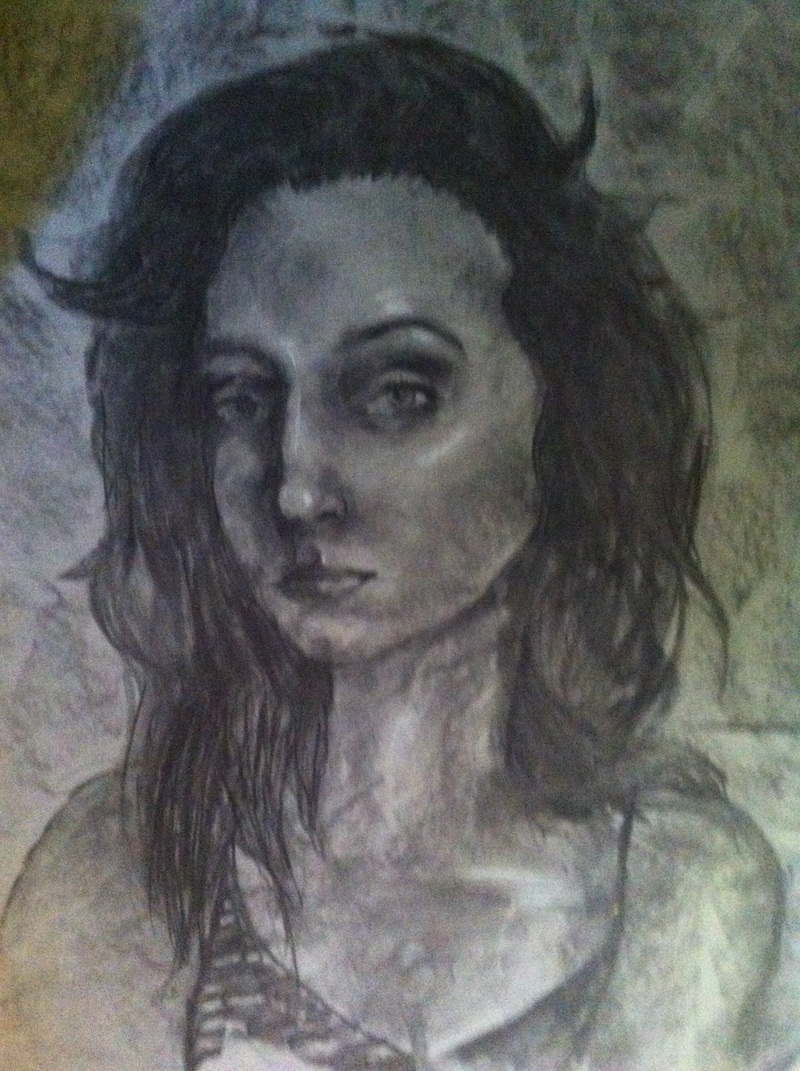
I earned an A in AP Art/Studio Art II because I completed all assignments and gave my best effort during every class. I struggled a bit in choosing between a 2-D Design Portfolio and a Drawing Portfolio, but in the end went with drawing. The work that I am most proud of completing is my AP Portfolio, which took me nearly the entire year. I’m so happy to finally have an organized portfolio of my best pieces. My concentration was portraits with different Halloween prosthetics and special effects. I have always enjoyed painting portraits, but I needed a focal point...I found this photography series that contained a lot of photos centered around gender and sexual identity and halloween prosthetics and I was so fascinated. The pictures weren’t necessarily “beautiful” to look at, but they were so intriguing and deep that I wanted to create something with that level of depth as well for my own portfolio to earn a 5. My summer work was a good jumpstarter for this class, even though I wasn’t completely satisfied with the way they turned out. The two pieces were excellent practice in using value with charcoal as the medium, which is a very important theme in a lot of my art. I love working with shadows and highlights and incorporating them into all my pieces. The assignments also forced me to think more about composition, which is something I never really think about. Composition is one of the most important components in a still life drawing, because they are all about the way things are laid out in a way that’s aesthetically pleasing and interesting to the looker. I also struggled with composition in the self-portrait because I had to work with such a huge piece of paper; which I was NOT used to at all. I spent forever trying to fill up the whole space in a way that was comprehensible and beautiful. I think I spent more time on trying to figure out how to utilize the entire space than on the drawing itself (which is something I really regret). Throughout the course of the entire year, however, I improved my skills in composition greatly, while also improving my drawing skills so that I never have to compromise the picture just to have it fit the paper again. Overall, I’ve developed my own art style as well as valuable skills, I have created original art that I’m proud of and communicated through it as well, I took chances that in the end worked in my favor (or taught me a valuable lesson if they didn’t work), I collaborated with other talented artists in my class, solved problems with my art, and reflected on how I solved those problems, or maybe how I didn’t solve those problems. Most importantly, I gained a more global awareness in artmaking, and found my own voice through what I wanted to communicate through my art work.
 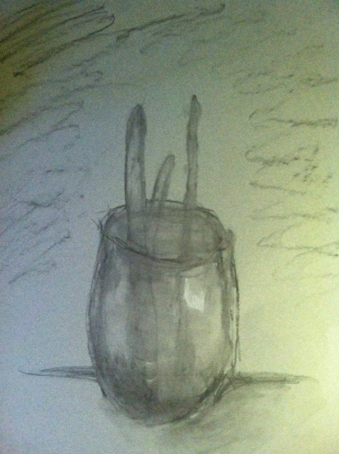 These two pieces are my summer art projects. One is a self portrait and the other is a still life. Both were done in charcoal on toned paper. These were really good assignments because they allowed me to demonstrate artistic behaviors. First of all, I created original art with these pieces, not only because I came up with them but because I expressed my own voice as an artist through them; I feel like they have a subtle stylistic quality. I don't really like how the still life came out, however, I feel like I should have chosen a better subject; one that was more interesting for me to draw and one that shows my personality a little better. As for learning new techniques and processes, I've worked a lot with charcoal before, but I definitely feel that these projects helped me improve immensely in my use of tone and value. I like the way my self portrait shows my personality in the expression that I chose. And even though it was part of the criteria for the assignment, the use of charcoal also kind of reflects who I am and my habits as an artist; if we could chose any medium I probably would do it in some sort of black-and-white value-based material because that's what I like. Unfortunately I think my subject for the still life could have reflected who I am as a person a little better. Looking back I realize it was somewhat uncreative of me to choose to draw a cup with paintbrushes in it. Even though it was a requirement, using a large sized paper was a very big challenge for me; I had to make sure that I had everything mapped out so it wouldn't look awkward or out of place on the large space. And that's something I usually don't have to worry about, even though I know I should always be thinking about how the picture is going to fit. I wasn't really able to collaborate with these two pieces this summer, but I did ask my family what they thought. It's not exactly the same as having another artist's opinion and constructive criticism, though. I think I will definitely use my still life as a learning opportunity because I'm not really happy with the way it turned out. I think if I were to choose this subject again, I would make the paintbrushes different and change the composition, because overall I think it was kind of weak. It's very important to reflect on your artwork, and think about what you did well and what you would change. It's a critical step in demonstrating artistic behavior, and without doing that I think I would never improve as an artist. When it comes to having a global awareness, it's also very important and crucial to observe other people's art and think about what they did that may have been different from what you did. It's kind of difficult to connect these assignments to a global scale, because they were designed to be very personal and individual. But I think it;s really great when art is political or has a message, and that's something I want to try to incorporate that more into my work in the future.
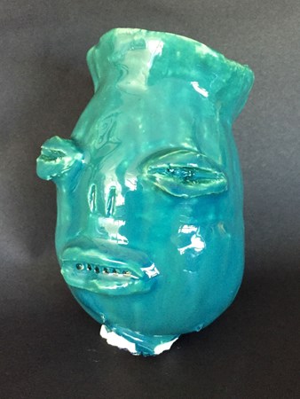 Unfortunately, I used a little too much glaze and the stand got stuck at the bottom of it. I kind of like the effect that using too much glaze had on the mouth, though. If you look closely, there's air bubbles that make an appearance of sharp teeth, which wasn't there before I glazed it. Overall, I like the way this mug came out, but next time I'll be sure to use less glaze and be more careful.
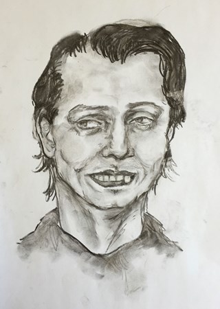
 This wasn't an assignment either, but rather something I did between assignments. I thought it would be funny to draw, I guess. I think I could still make this drawing look a lot better, but there's only so much you can do when you're working with Steve Buscemi's face. I used black and white charcoal and focused on blending the different values.
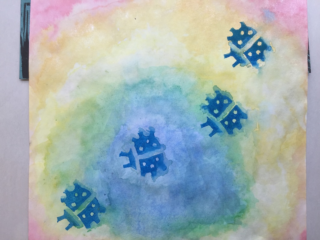
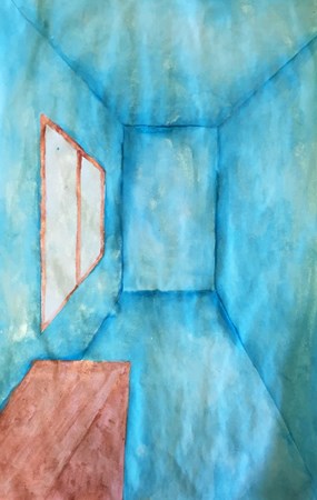 This was a one point perspective drawing of a room. I was originally going to make this a bathroom, but all the different vanishing points and guidelines got too confusing. I still like the way it came out, however. The watercolors were really fun to use and experiment with. For the blue I used a mix of a regular blue with a lot of water, and a metallic, shimmery blue-silver color. I don't really care much for the brown color I used, but I think the blue gives it a nice effect, even though the drawing is simple.
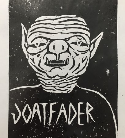
 The assignment was to use words to fill in the dark values, but that didn't really work out for this. I don't think words would fill in the dark values in a comprehensible way; I was afraid that it might just make the picture look weird and not very much like me. So instead, I used a sharpie to fill in all the dark values and used sidewalk chalk to add color, which I think has a very unique effect, especially when blended. For the backround, I just added things that I liked so it felt more personal.
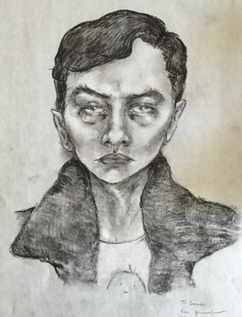 This wasn't really an assignment, but while I had finished what I was doing I worked on this charcoal drawing of Dane Dehaan. I loved using black and white charcoal to add highlights. Values are really interesting and fun for me to draw, so I enjoy black and white portraits.
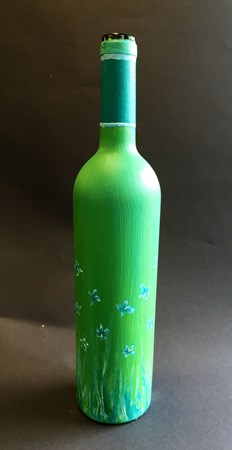 I really liked doing this project because there was a lot of creative and artistic freedom. There weren't any rules or guidelines that we had to follow; we could do whatever we wanted on the bottle. At first, I painted the entire thing yellow but I didn't really think it went with the color scheme I was going for, so I went over the yellow with blue and it made this green color. I couldn't find a thin enough brush for the center of the flowers, so I used a palette knife. I like the way this came out and the bottle looks nice with lilacs in it.
|
Authorjohanna carr Archives
May 2016
Categories |
 RSS Feed
