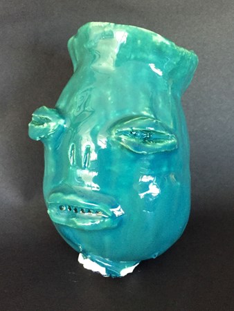
Unfortunately, I used a little too much glaze and the stand got stuck at the bottom of it. I kind of like the effect that using too much glaze had on the mouth, though. If you look closely, there's air bubbles that make an appearance of sharp teeth, which wasn't there before I glazed it. Overall, I like the way this mug came out, but next time I'll be sure to use less glaze and be more careful.
This wasn't an assignment either, but rather something I did between assignments. I thought it would be funny to draw, I guess. I think I could still make this drawing look a lot better, but there's only so much you can do when you're working with Steve Buscemi's face. I used black and white charcoal and focused on blending the different values.
This was a one point perspective drawing of a room. I was originally going to make this a bathroom, but all the different vanishing points and guidelines got too confusing. I still like the way it came out, however. The watercolors were really fun to use and experiment with. For the blue I used a mix of a regular blue with a lot of water, and a metallic, shimmery blue-silver color. I don't really care much for the brown color I used, but I think the blue gives it a nice effect, even though the drawing is simple.
The assignment was to use words to fill in the dark values, but that didn't really work out for this. I don't think words would fill in the dark values in a comprehensible way; I was afraid that it might just make the picture look weird and not very much like me. So instead, I used a sharpie to fill in all the dark values and used sidewalk chalk to add color, which I think has a very unique effect, especially when blended. For the backround, I just added things that I liked so it felt more personal.
This wasn't really an assignment, but while I had finished what I was doing I worked on this charcoal drawing of Dane Dehaan. I loved using black and white charcoal to add highlights. Values are really interesting and fun for me to draw, so I enjoy black and white portraits.
I really liked doing this project because there was a lot of creative and artistic freedom. There weren't any rules or guidelines that we had to follow; we could do whatever we wanted on the bottle. At first, I painted the entire thing yellow but I didn't really think it went with the color scheme I was going for, so I went over the yellow with blue and it made this green color. I couldn't find a thin enough brush for the center of the flowers, so I used a palette knife. I like the way this came out and the bottle looks nice with lilacs in it.
|
Authorjohanna carr Archives
May 2016
Categories |